Foodlink
Enhanced value through multifold increase in
efficiency and stickiness
In A Nutshell
A system design initiative for an online supply chain application that caters to farm produce and connects farm produce aggregators to buyers. The design strategy included a super efficient concept design that increases task efficiency multifold, and improves engagement with the application.
Defining The Problem
A multi-faceted application, Food Link SaaS application connects the fresh food supply chain that includes an online network of over 2000+ growers, shippers, farm produce aggregators, and retailers.
With a user base of over 10,000 people, users of this application- buyers working for retailers, and supplier aggregators- spend most of their day interacting with this application to go about their daily tasks.
While the applications’ value proposition was unique, the business was facing a bottleneck in increasing user adoption rates because of the organically developed legacy system, that had multiple experience related challenges.
Analysis and Solution
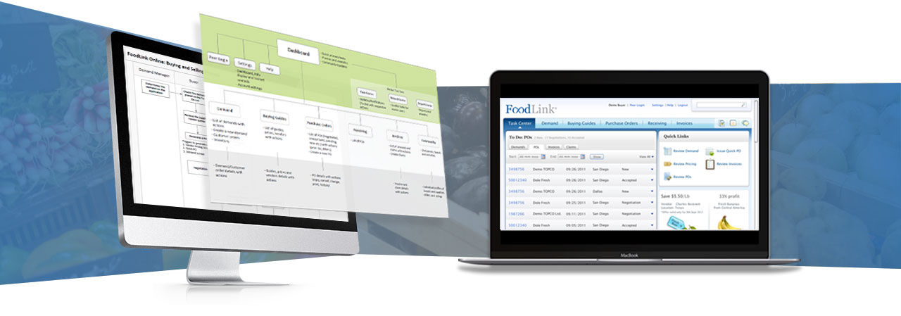
Analysis of the existing design revealed that the application lacked a cohesive structure, quick starting points for frequently done tasks, and a redundant navigation structure. This contributed to users not able to discover the various features provided by the application or couldn’t follow the flow of information.
Poorly designed forms, excessive steps for simple tasks and a fragmented structure were some of the key areas that needed recalibration.
Our approach was to simplify the interaction without comprising on its complexity, re-defining the structure and navigation, logical grouping of tasks and an overall consistency through visual language. The concept of workbench was effective in letting the users complete 80% of critical tasks from the first screen itself.
As a part of the UX strategy, YUJ Designs also built in gamification that would bring the users back to the application frequently, thus making it more sticky.


