StubHub
Redesign the buying experience for a secondary ticketing marketplace
In A Nutshell
Redesigning the secondary ticketing marketplace web experience that engages buyers through the ease of discoverability and task efficiency
Defining The Problem
The customer is largest online secondary ticket marketplace in the United Stated. It caters to sports, theatre, concerts and other live entertainment events. They were concerned about low conversion rates of their buyer business. The ticket buying experience are series of pages with rich content and features yet had stagnated conversion.
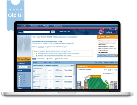
Poor representation of event schedules and seat maps, redundant and confusing labels, unintui-tive categorization of content made the overall experience quite cumbersome for the buyers.
Driven by User Research, Concept Design and User Testing, YUJ Designs delivered a solution that streamlined the ticket buying flow and helped increase the overall conversion rate by 4.4%.
Solution
Booking the right tickets buyer’s first and most critical step in the process of enjoying the desired event. This task can be divided into three parts, finding an event, reserving the right seats based on the view they want, and booking the tickets at the right price. The challenge for YUJ Designs was to ensure the buyer could do this in minutes in the most efficiency and effective way.
Through user research and detailed analysis of the existing task flow gave us insights into the pain points of users. A complex search mechanism hampered discoverability of new events. A seat reservation flow that was static and the time taken to complete the purchase flow itself were some of the deterrents.
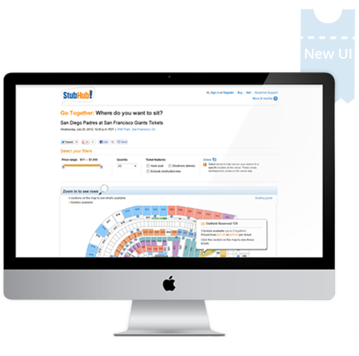
Some of the major enhancements that were made to the website included regrouping of information, redesigning micro interactions, reducing the number of steps wherever necessary and ensuring visibility of key information at every steps.
In collaboration with a 3rd party a dynamic seat-map that gives the buyer a virtual feel of the event was designed. It showed the seat row configuration, the seat number, view from the seat, the pricing.
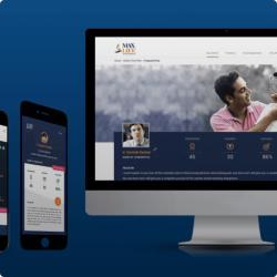
After rigorous testing the designs with buyers similar experience was redesign for the customers native app. The impact of culling the clutter, redesigning new functions, dynamic seat-view and reduced task steps helped the marketplace in generating additional revenue with 10.6& increase in the overall sales. The dynamic seat-map view with its fresh approach at engaging
