Value research
Crafted investment experience that exudes trust and
enables investors to make informed decisions
In A Nutshell
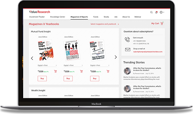
A design quest that revamped the website of Dhirendra Kumar, a leading financial advisor into one of the most sought after knowledge banks for investors of different levels. User Research, UX Strategy, Interaction Design and Visual Design were the core values provided.
Defining The Problem
Value Research Online is a website led and driven by Dhirendra Kumar, a renowned name in the finance industry of India. The website is rich in content and complexity as it aims at advising users on the various investment options available in the market.
However, undirected and unilateral grouping of information, crowded webpages and the lack of visibility of important features hampered the usefulness of the website. Therefore the goals of this project were to increase the active and registered user base within the first 30 days of launch, increase of revenue by promoting paid products and subscriptions and increase user engagement by helping them in becoming more informed about the investment market.


Solution
The design approach of this project can be broadly categorised into six steps; business insights, design strategy, usability testing, detailed design and implementation.
Defining business goals through stakeholder workshops, website review and competitor analysis was the first step in the process that helped us in chalking the design goals. To further furbish the design strategy various concepts were developed that included information architecture, interaction design and identity design.
The next step in the process was formative testing with the intended user base to understand the impact of the design and inculcate the feedback received into the detailed design. Their existing product failed to capture the user’s attention and didn’t give them any directions on what to do next. Weak CTA’s, overuse of their red brand colour and an old visual style nullified the impact of the content.
Therefore, our focus was on making the structure more concise, adding meaningful interactions and re-grouping the content to give the scent of a well tailored knowledge bank to our end users.
Primary focus was given to blogs written by the financial advisors, reports and ratings of different mutual funds and stocks that could be profitable options for the investors. To further build on the interaction, specific filters like steady growth, best tax savers and nearly risk free investments were added to the search results.
The final design that was delivered narrated an overall story that users could follow with the help of clean, minimal visual design.


