DataMate - A core banking solution
User Experience enables effortless banking
UX Behind Global Success
A new flawless and intuitive banking application experience was crafted for DataMate - a flagship product of DataVision Software Solutions to create its global presence which will help it to captivate an international audience. Its primary goal is to help the banking professionals to perform their internal banking operations efficiently. The design strategy included a coherent and well-organised concept design that helped to increase the user experience of the product by the bankers.
Motivation behind revamping
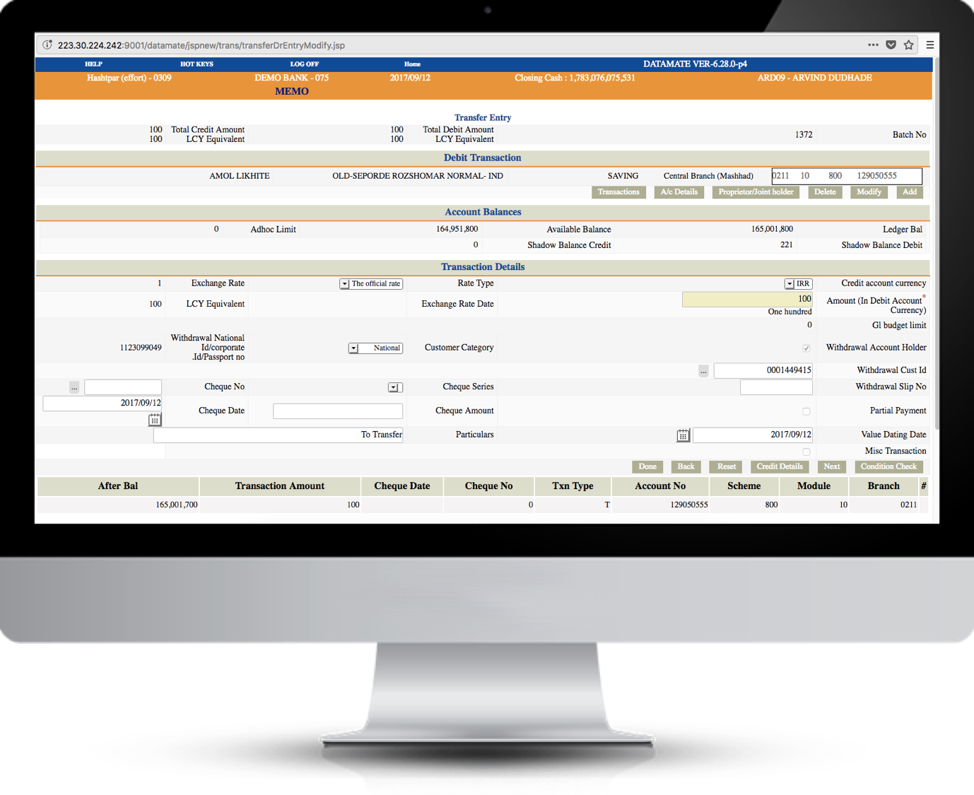
An initial review revealed that the core banking application needed critical attention in terms of how information was presented and accessed by users. For instance, most modules were listed one after the another and ungrouped. This not only affected the scanability and discoverability of critical information but had a negative impact on brand perception.


Approach of Co-creation
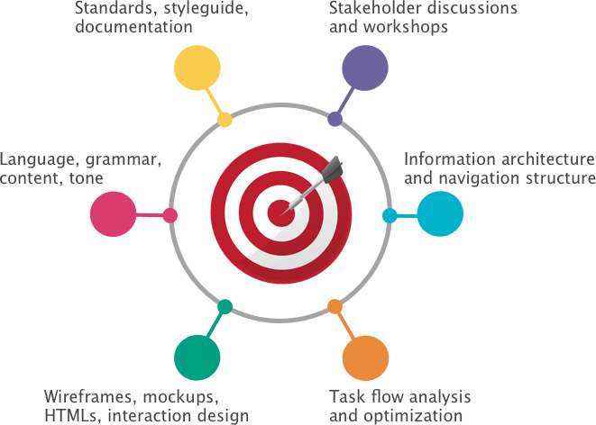
Our approach to design solution was to begin by understanding the client’s business goal, vision for the market and critical success factors. Through series of walk-through, brain-storming and co-creation sessions we arrived at a conceptual model to layout all user activities, steps, and functions that are standard and logical — not only for the users but different end-client scenarios.
The concept then was backed up by a strong visual design strategy that became the foundation to standardise components, page types, guidelines for elements within a page and overall white-label-ing of the product.
Return on Investment
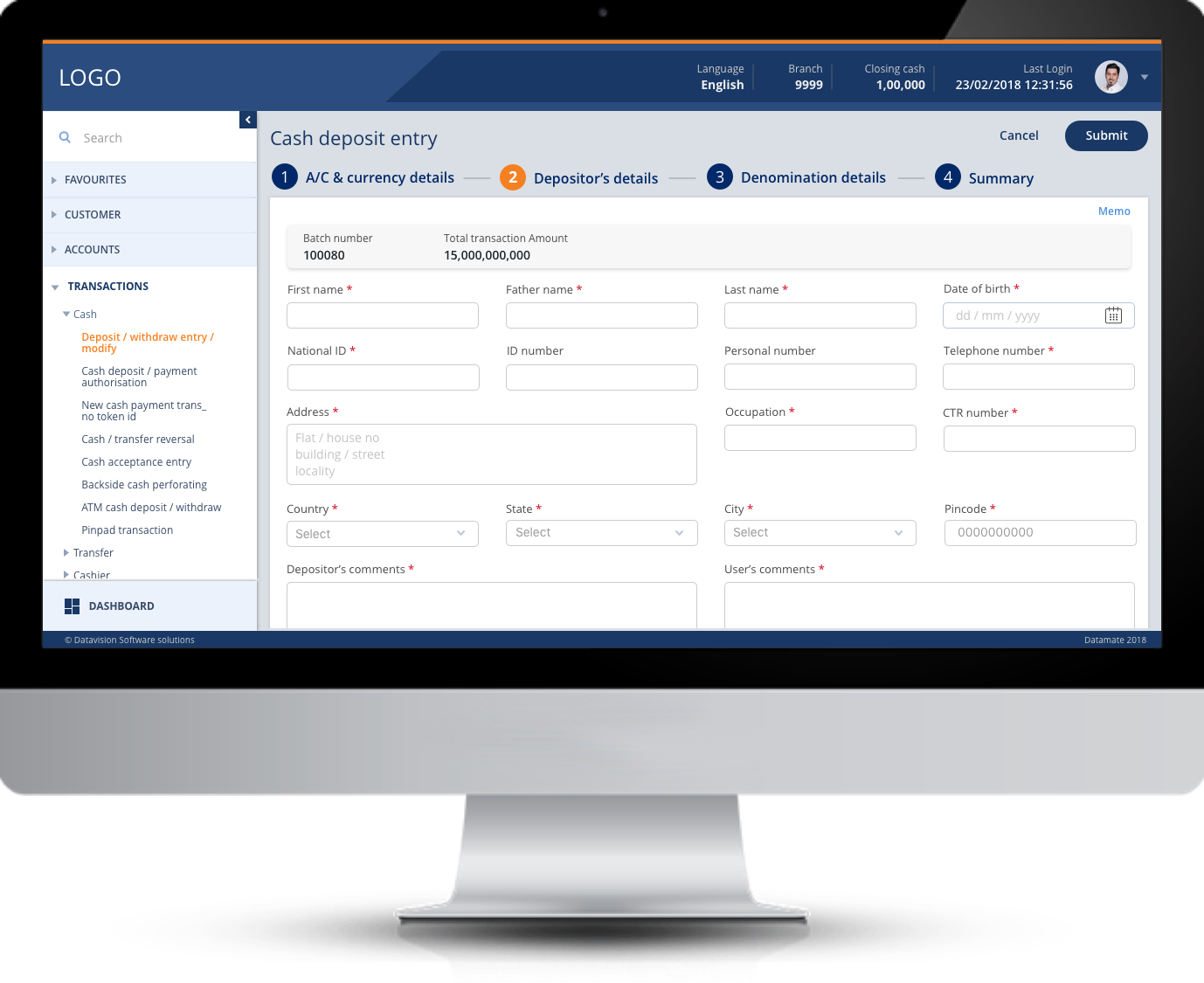
The end result was a visually appealing and delightful experience for the end users. List of modules was grouped, labeled and accessed through a persistent navigation model. The redesign initiative brought huge efficiency and brought down the number of clicks and time spent by users to complete their work by up to 20%. This had an impact on the indirect cost of training the users as well.
End Result
YUJ Designs developed a spacious and non-messy visually appealing design for a delightful user experience. Complex navigation structure of 576 links in 34 groups that was displayed only on home page, was reorganised systematically into 12 groups and shown as a collapsible panel on each page with quick search feature. This helped users to hop between tasks and find links easily. Complicated and large tasks were made brief and simpler, thus reducing clicks by 20%. This helped employees to give more productivity in less time. Reduced training time also meant reduced cost and more profits.
Language, grammar and general writing style were given a finishing effect by developing a unique, professional and comprehensive content. YUJ Designs developed standards for the design and development of the product that helped us and the client to maintain consistency in the design even for modification in the future, if required. These standards aided to create an amazing product that will help the client to boost its business. The application helped to build a strong identity for the client’s business and open up new markets for them thereby providing new revenue streams.


