Elastic run
Facilitating revenue collection through holistic service design
![]()
In A Nutshell
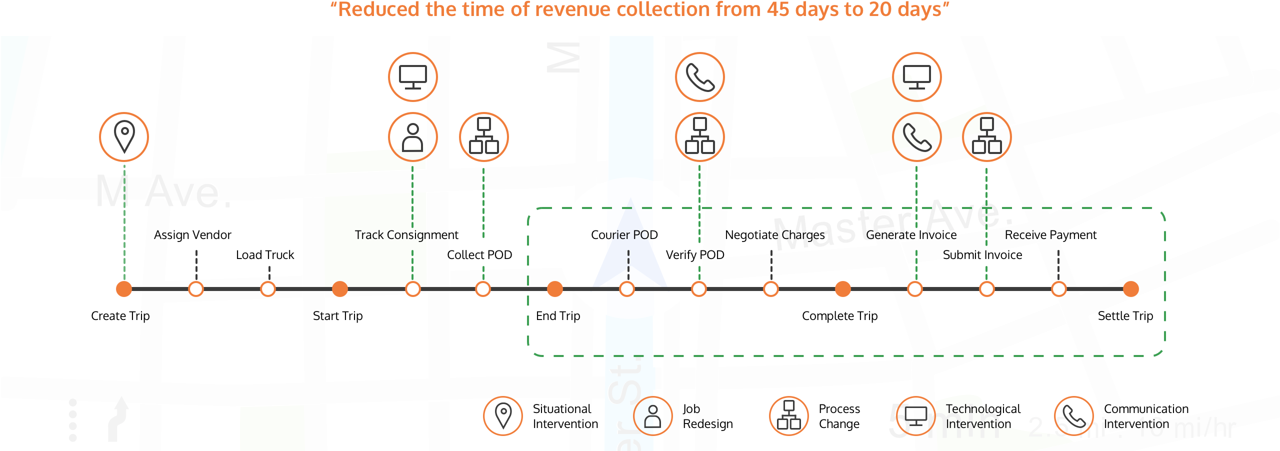
Planning a trip is easy but revenue recovery challenge starts when the trip ends. We redesigned the digital UX for one of our clients and also provided them practical ideas across processes, people, and communication problems. The main objective of redesigning the application was to plug the leaks in revenue collection.
Defining the Problem
- As system thinkers, we investigated all touch points and identified critical gaps in processes, technology, peoples’ roles and communication.
- The entire process had a lot of friction points, especially in collecting and verifying the proof of delivery (POD), negotiating charges and generating invoices.
- A major issue in the current product was delay in completing the tasks due to numerous action items.
- Important actions would be hidden among other recently added items.
- Delays in delivering invoices was another problem.

Solution
- We redesigned the application to allow for visibility and focus on the most important tasks. The colour palette was revamped to support these goals while reinforcing the brand identity.
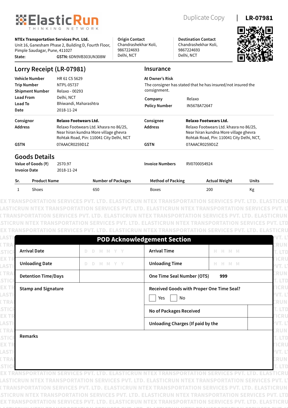
- We redesigned the existing Proof of Delivery(POD) form by grouping relevant fields together, which cut down the chances of error and guide the external users to fill the details properly.
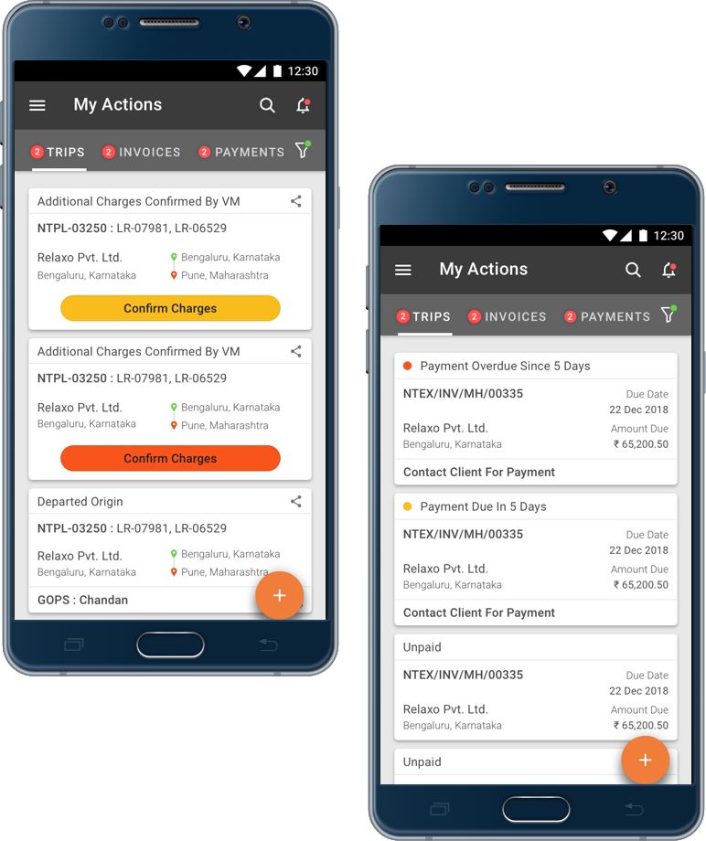
- We made the charge negotiation process easy by increasing transparency among team members on the agreed charges and simplifying the charges interactions while providing an overall view of total charges.
- We eliminated delays in delivering invoices by redesigning invoice acceptance and delivery confirmation pages.
Business Benefits
- The redesigned application have a direct impact on revenue recovery.
- The application helps to track fleets and obtain real time information on movement.
- It considerably reduces the POD recovery, invoice generation and revenue settlement time
More from our works
Read more
